|
 |
| Rank | Posts | Team |
| International Board Member | 32366 | No
Team
Selected |
| Joined | Service | Reputation |
| Oct 2002 | 22 years | |
| Online | Last Post | Last Page |
| Feb 2025 | Feb 2025 | LINK |
| Milestone Posts |
|
| Milestone Years |
|
|
| Location |
|
| Signature |
|
TO BE FIXED |
|
|
|
|
|
| Rank | Posts | Team |
| Player Coach | 4722 | No
Team
Selected |
| Joined | Service | Reputation |
| Apr 2010 | 15 years | |
| Online | Last Post | Last Page |
| Feb 2025 | Sep 2024 | LINK |
| Milestone Posts |
|
| Milestone Years |
|
|
| Location |
|
| Signature |
|
TO BE FIXED |
|
| Quote ="100% Warrior"The irony is that we’ve put out a new badge trying to move the sport and our club forward but in the same 24hrs voted not to let the fastest growing team in an international city with unbelievable potential back into Super League.
Chances are now SL will promote a stagnant club like Leigh/Featherstone. How glamourous.'"
to be fair they put themselves out of the league ..... |
|
|
|
| Rank | Posts | Team |
| International Board Member | 20483 | No
Team
Selected |
| Joined | Service | Reputation |
| Mar 2003 | 22 years | |
| Online | Last Post | Last Page |
| Feb 2025 | Feb 2025 | LINK |
| Milestone Posts |
|
| Milestone Years |
|
|
| Location |
|
| Signature |
|
TO BE FIXED |
|
|
In business you need to keep trying new things to keep moving forward, to attract new business and increase the profile of the Wigan brand.
Some things have worked really well (I think the annual Skolars match is worth its weight in gold for instance, long may that continue) other things haven't worked as well both financially and annoying the supporters such as Millwall and the Australia/Hull FC trip both of which would have been carefully planned no doubt but ultimately failed.
I don't mind gambles in business as long as the risks have been calculated, if the pros outweigh the cons. This brand re-design has no doubt been planned for a couple of years. One thing I know, its given us exposure on numerous media outlets (Granada Reports, BBC North West.... etc), whilst the vast majority of supporter reactions has been negative at best, horrified at worst I guarantee one thing.... by the time we start letting supporters into the stadium there will be literally thousands of supporters wearing merchandise which includes that logo.
How replica shirt sales this off season compare to the last few years is up for debate, but unless merchandise sales drop like a stone it's here to stay.
|
|
|
| Rank | Posts | Team |
| Club Coach | 7439 | No
Team
Selected |
| Joined | Service | Reputation |
| Feb 2005 | 20 years | |
| Online | Last Post | Last Page |
| Oct 2024 | Oct 2024 | LINK |
| Milestone Posts |
|
| Milestone Years |
|
|
| Location |
|
| Signature |
|
TO BE FIXED |
|
| Quote ="Pieman"to be fair they put themselves out of the league .....'"
That’s why I said “back”
The ultra irony is Hull KR have effectively done the same. I patiently await calls to boot them out of SL..... |
|
|
| Rank | Posts | Team |
| Player Coach | 4722 | No
Team
Selected |
| Joined | Service | Reputation |
| Apr 2010 | 15 years | |
| Online | Last Post | Last Page |
| Feb 2025 | Sep 2024 | LINK |
| Milestone Posts |
|
| Milestone Years |
|
|
| Location |
|
| Signature |
|
TO BE FIXED |
|
| Quote ="100% Warrior"That’s why I said “back”
The ultra irony is Hull KR have effectively done the same. I patiently await calls to boot them out of SL.....'"
how? They fulfilled the minimum 15 and they might know more than us in regards to when the season is ending |
|
|
|
| Rank | Posts | Team |
| Club Coach | 18737 | No
Team
Selected |
| Joined | Service | Reputation |
| Jul 2005 | 20 years | |
| Online | Last Post | Last Page |
| Feb 2025 | May 2024 | LINK |
| Milestone Posts |
|
| Milestone Years |
|
|
| Location |
|
| Signature |
|
TO BE FIXED |
Moderator
|
| Quote ="Ruddy Duck"In the report on Granada, Kris Radlinski says that he could not care less what people say.'"
Word for word, that's what he said?
Because I've just watched the Granada Reports interview on twitter and I didn't hear him say that at all. I didn't even hear him hint at anything like that. |
|
|
| Rank | Posts | Team |
| International Chairman | 5392 | No
Team
Selected |
| Joined | Service | Reputation |
| Dec 2001 | 23 years | |
| Online | Last Post | Last Page |
| Jan 1970 | Jun 2022 | LINK |
| Milestone Posts |
|
| Milestone Years |
|
|
| Location |
|
| Signature |
|
TO BE FIXED |
|
|
I wonder sometime what world some supporters are living in when they think that a club in Canada or indeed the USA where team sports like American Football, Baseball, Basketball, Ice Hockey even Lacrosse and Soccer are far bigger where crowds and finance are concerned.
As for adverse comments about long standing and established clubs like Featherstone Rovers and Leigh, I wonder if those making the comments would be saying the same if Wigan ( who nearly were a few years ago, but for the gang of four) were possibly regular members of the Championship.
They should also remember Blackpool Borough, Chorley Lynx, Kent Invicta, Liverpool City/Stanley later Huyton, Mansfield, Tameside Borough etc, clubs from outside the traditional Rugby League playing area who have all gone by the wayside when the novelty had worn off and crowds have gone as a result of losing more game than they would ever win.
Even the world wide game of Rugby Union cannot get established on the same level as the North America sports I have mentioned, so what chance if any, has Rugby League with one or two clubs with lower finance and crowds.
When Toronto withdrew, they were bottom with a squad which already with the few games they had played, was showing that it was not of the required quality and standard of the Super League.
|
|
|
| Rank | Posts | Team |
| International Board Member | 32366 | No
Team
Selected |
| Joined | Service | Reputation |
| Oct 2002 | 22 years | |
| Online | Last Post | Last Page |
| Feb 2025 | Feb 2025 | LINK |
| Milestone Posts |
|
| Milestone Years |
|
|
| Location |
|
| Signature |
|
TO BE FIXED |
|
| Quote ="Pemps"Word for word, that's what he said?
Because I've just watched the Granada Reports interview on twitter and I didn't hear him say that at all. I didn't even hear him hint at anything like that.'"
That's because he didn't.
I've also watched the interviews on Wigan tv and he didn't say it on there either. |
|
|
|
| Rank | Posts | Team |
| Player Coach | 5193 | No
Team
Selected |
| Joined | Service | Reputation |
| Jan 2006 | 19 years | |
| Online | Last Post | Last Page |
| Aug 2024 | Mar 2024 | LINK |
| Milestone Posts |
|
| Milestone Years |
|
|
| Location |
|
| Signature |
|
TO BE FIXED |
|
|
It makes me laugh when people start the whole 'You have to accept change/if you don't change you're a dinosaur/business needs change etc ballcocks. Thats like a silver bullet which allows people in power to do what they want, change want they want and sneer at those who don't agree with them. Its almost tyrannical.
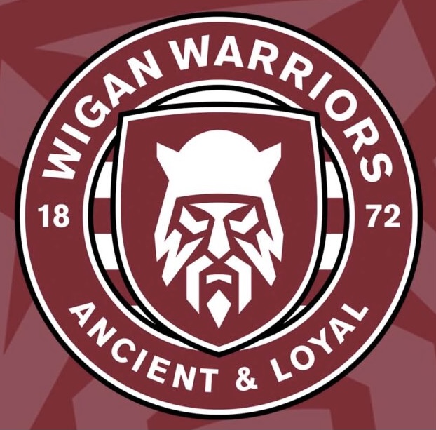
The new badge looks like a white walker on a costa coffee logo, maybe the designer has been subtly influenced by his love of Game of Thrones and Costa Coffee.
Maybe the players like the badge because they spend more time in Costa Coffee than playing rugby.
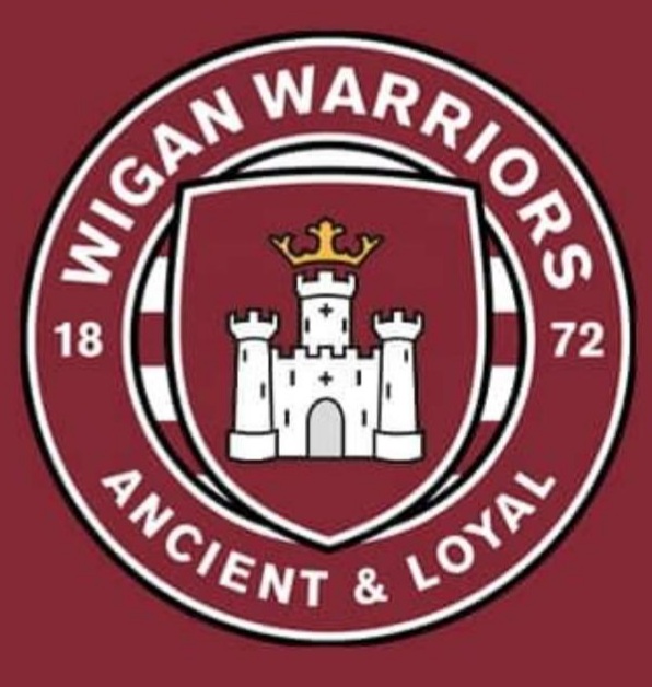
All in all what they have done and how they have done it is a disgrace, the badge as it is may need modernising but not changing. You could take our badge and lessen the detail and make the badge better for digital platforms but not change it.
They mentioned having it like the Northern Soul badge, well that badge signifies Northern Soul and always will, to steal it won't make our brand more identifiable but more like a snide copy of the Northen Soul logo like you get the Keep Calm posters and different variations.
The whole 'I see a steely look in every Wiganer and also 2000 years ago there were Brigantes in this area' rubbish. You may aswell have a bloke with a flat cap, a woodbine and a whippet on his way to the mill as our logo if thats the case. What a load of dross.
How much has this cost? I had an email with the club begging for money in March because of Covid, how much have they spent on this unwanted, unwarranted vanity project?
|
|
|
| Rank | Posts | Team |
| Player Coach | 5193 | No
Team
Selected |
| Joined | Service | Reputation |
| Jan 2006 | 19 years | |
| Online | Last Post | Last Page |
| Aug 2024 | Mar 2024 | LINK |
| Milestone Posts |
|
| Milestone Years |
|
|
| Location |
|
| Signature |
|
TO BE FIXED |
|
|
Can someone who is good on a computer rig up a similar badge but instead of the White Walker, put the Castle with crown on top (Yes Ive seen that one rigged up already) but also the lions either side and the king on top etc.
|
|
|
| Rank | Posts | Team |
| International Star | 4470 | No
Team
Selected |
| Joined | Service | Reputation |
| Jan 2013 | 12 years | |
| Online | Last Post | Last Page |
| Oct 2024 | Oct 2024 | LINK |
| Milestone Posts |
|
| Milestone Years |
|
|
| Location |
|
| Signature |
|
TO BE FIXED |
|
| Quote ="post"Can someone who is good on a computer rig up a similar badge but instead of the White Walker, put the Castle with crown on top (Yes Ive seen that one rigged up already) but also the lions either side and the king on top etc.'"
So basically, the current crest? |
|
|
|
| Rank | Posts | Team |
| International Star | 4470 | No
Team
Selected |
| Joined | Service | Reputation |
| Jan 2013 | 12 years | |
| Online | Last Post | Last Page |
| Oct 2024 | Oct 2024 | LINK |
| Milestone Posts |
|
| Milestone Years |
|
|
| Location |
|
| Signature |
|
TO BE FIXED |
|
| Quote ="MattyB"In business you need to keep trying new things to keep moving forward, to attract new business and increase the profile of the Wigan brand.
Some things have worked really well (I think the annual Skolars match is worth its weight in gold for instance, long may that continue) other things haven't worked as well both financially and annoying the supporters such as Millwall and the Australia/Hull FC trip both of which would have been carefully planned no doubt but ultimately failed.
I don't mind gambles in business as long as the risks have been calculated, if the pros outweigh the cons. This brand re-design has no doubt been planned for a couple of years. One thing I know, its given us exposure on numerous media outlets (Granada Reports, BBC North West.... etc), whilst the vast majority of supporter reactions has been negative at best, horrified at worst I guarantee one thing.... by the time we start letting supporters into the stadium there will be literally thousands of supporters wearing merchandise which includes that logo.
How replica shirt sales this off season compare to the last few years is up for debate, but unless merchandise sales drop like a stone it's here to stay.'"
Unless their parents say "you're not having anything with that logo on" kids will all still want the kit for xmas. They don't care what crest or kit we have in the main. Are they the target audience?
The big test will be what the happy clappers do. What will those who buy a wigan pooper scooper and wigan branded poo bags do? |
|
|
| Rank | Posts | Team |
| Player Coach | 5193 | No
Team
Selected |
| Joined | Service | Reputation |
| Jan 2006 | 19 years | |
| Online | Last Post | Last Page |
| Aug 2024 | Mar 2024 | LINK |
| Milestone Posts |
|
| Milestone Years |
|
|
| Location |
|
| Signature |
|
TO BE FIXED |
|
| Quote ="Egg Chasing"So basically, the current crest?'"
Yes but in the current format just to see it modernised. Like your avatar but with the lions and king and that section slightly bigger. |
|
|
| Rank | Posts | Team |
| International Chairman | 5392 | No
Team
Selected |
| Joined | Service | Reputation |
| Dec 2001 | 23 years | |
| Online | Last Post | Last Page |
| Jan 1970 | Jun 2022 | LINK |
| Milestone Posts |
|
| Milestone Years |
|
|
| Location |
|
| Signature |
|
TO BE FIXED |
|
|
The badge has been designed to attract the younger generation, but the designer has put in the middle, a image of a old and sick looking Viking.
Perhaps a image of Mighty Max would been more appropriate!
|
|
|
| Rank | Posts | Team |
| Player Coach | 5193 | No
Team
Selected |
| Joined | Service | Reputation |
| Jan 2006 | 19 years | |
| Online | Last Post | Last Page |
| Aug 2024 | Mar 2024 | LINK |
| Milestone Posts |
|
| Milestone Years |
|
|
| Location |
|
| Signature |
|
TO BE FIXED |
|
| Quote ="Ruddy Duck"The badge has been designed to attract the younger generation, but the designer has put in the middle, a image of a old and sick looking Viking.
Perhaps a image of Mighty Max would been more appropriate!'"
The whole 'attract a younger generation' thing is tosh aswell, you accept the existing badge and grow to love it. I remember going home from Central Park as a kid and seeing the Wigan badge on a substation just past the police station heading towards Poolstock Lane. I grew up doodling that badge in the back of my school books.
For me, there is far too much change and change for change sake. We need a cherry and white hooped shirt every season, with little change, maybe add piping, or add a black collar, make the hoops 5mm wider, then the next year 5mm narrower and thats it. Experiment with the away shirt only, every 5 years and each other time have the same shirt as the home but blue instead of cherry.
Keep the badge but modernise it slightly. |
|
|
| Rank | Posts | Team |
| Club Coach | 18737 | No
Team
Selected |
| Joined | Service | Reputation |
| Jul 2005 | 20 years | |
| Online | Last Post | Last Page |
| Feb 2025 | May 2024 | LINK |
| Milestone Posts |
|
| Milestone Years |
|
|
| Location |
|
| Signature |
|
TO BE FIXED |
Moderator
|
| Quote ="post"Yes but in the current format just to see it modernised. Like your avatar but with the lions and king and that section slightly bigger.'"
The lions are too intricate. That's the issue with the current logo.
As you know i did some retro shirts, just over 10 years ago now, and the main issues with them were the detail in the logo. I thought at the time it was a little dated, particularly compared with the other teams in SL. The reasons for the change make absolute sense. I totally get the reasoning behind it. Digital media is the future., Apps on phones, social media.. Everything is online. the print industry is dying. Look at the wigan logo on a phone screen when it's small. It just turns to a blur of gold and red. The logo needs to be basic and work as a single colour or 2 colour block. Look at all the most successful brands in the world. Apple, Levis, Facebook, Adidas, Nike, Toyota, Pornhub, Starbucks... Even sports clubs like Man Utd, Barcelona, NBA, NFL... They're all simple and easily identifiable from a distance. Stick the current wigan crest on a photograph of a crowd scene and you'll lose it. Stick the new one on the same pic and it stands out. It can be reproduced in the 2 colour red and white or just done in white, red, black, green, blue.. It works.
I will add that I think a nod to the current logo would have been a good idea, whether that's the castle or the knights head, but I don't know how that would work with the warrior brand. |
|
|
| Rank | Posts | Team |
| Club Owner | 237 | No
Team
Selected |
| Joined | Service | Reputation |
| Oct 2003 | 21 years | |
| Online | Last Post | Last Page |
| Jan 2025 | Oct 2024 | LINK |
| Milestone Posts |
|
| Milestone Years |
|
|
| Location |
|
| Signature |
|
TO BE FIXED |
|
| Quote ="Pemps"The lions are too intricate. That's the issue with the current logo.
As you know i did some retro shirts, just over 10 years ago now, and the main issues with them were the detail in the logo. I thought at the time it was a little dated, particularly compared with the other teams in SL. The reasons for the change make absolute sense. I totally get the reasoning behind it. Digital media is the future., Apps on phones, social media.. Everything is online. the print industry is dying. Look at the wigan logo on a phone screen when it's small. It just turns to a blur of gold and red. The logo needs to be basic and work as a single colour or 2 colour block. Look at all the most successful brands in the world. Apple, Levis, Facebook, Adidas, Nike, Toyota, Pornhub, Starbucks... Even sports clubs like Man Utd, Barcelona, NBA, NFL... They're all simple and easily identifiable from a distance. Stick the current wigan crest on a photograph of a crowd scene and you'll lose it. Stick the new one on the same pic and it stands out. It can be reproduced in the 2 colour red and white or just done in white, red, black, green, blue.. It works.
I will add that I think a nod to the current logo would have been a good idea, whether that's the castle or the knights head, but I don't know how that would work with the warrior brand.'"
Great post and explanation. On the Facebook, Wigan Warriors Supporters Forum, a guy called Matt Baines has designed home and away shirts plus a new ‘logo style’ badge. The badge incorporates the two lions, a crown, the castle on a shield with the words Ancient & Loyal. Wigan Warriors is written underneath. Very impressive the designs are too. The only change I would make to the badge, would be to include 1872 as well.
The kits are the now usual darker shade of cherry with five thin white hoops and white trim on collar and cuffs. The away shirt is a direct opposite, being mainly white but with five thin cherry hoops and cherry trim on collar and cuffs. They must have been knocked up within an hour or so of the new stuff being leaked. The kits look ace and I would buy them without hesitation. I’ve tried to copy and paste them but it doesn’t seem to work.
I love our long standing club crest but I think Pemps is right and for the reasons he highlights. Folk of a certain age (me included) tend to resist change but I feel once folk see the lads wearing the new badge on the new kits and merchandise, it will grow. |
|
|
| Rank | Posts | Team |
| Player Coach | 3092 | No
Team
Selected |
| Joined | Service | Reputation |
| Feb 2006 | 19 years | |
| Online | Last Post | Last Page |
| Mar 2023 | Feb 2023 | LINK |
| Milestone Posts |
|
| Milestone Years |
|
|
| Location |
|
| Signature |
|
TO BE FIXED |
|
| Quote ="Pemps"
I will add that I think a nod to the current logo would have been a good idea, whether that's the castle or the knights head, but I don't know how that would work with the warrior brand.'"
You get rid of the warrior brand. It's a failed name which is not loved and not required when the place name tells you everything you need to know about the town, the club and what sport it is playing.
Not many, hopefully, are seriously suggesting there was no need for a badge update for all the reasons you state. But they've focussed on totally the wrong thing - the identity of the club is not the Warriors part, let's be honest nobody cares about that. The club is famous for being Wigan and Wigan is famous for Rugby League. |
|
|
| Rank | Posts | Team |
| Club Coach | 18737 | No
Team
Selected |
| Joined | Service | Reputation |
| Jul 2005 | 20 years | |
| Online | Last Post | Last Page |
| Feb 2025 | May 2024 | LINK |
| Milestone Posts |
|
| Milestone Years |
|
|
| Location |
|
| Signature |
|
TO BE FIXED |
Moderator
|
| Quote ="Darwen Warrior"Great post and explanation. On the Facebook, Wigan Warriors Supporters Forum, a guy called Matt Baines has designed home and away shirts plus a new ‘logo style’ badge. The badge incorporates the two lions, a crown, the castle on a shield with the words Ancient & Loyal. Wigan Warriors is written underneath. Very impressive the designs are too. The only change I would make to the badge, would be to include 1872 as well.'"
I've seen it, and it doesn't work. The Ancient & Loyal is too small and the lions are to intricate. whoever designed that hasn't listened to the brief at all.
I'm not a fan of the home kit but the away one looks decent, if a little like a retro Manly kit.
With regards to the new kit that we've seen sneak previews of... Swap the black and red around and it makes a great away kit. |
|
|
| Rank | Posts | Team |
| Club Coach | 18737 | No
Team
Selected |
| Joined | Service | Reputation |
| Jul 2005 | 20 years | |
| Online | Last Post | Last Page |
| Feb 2025 | May 2024 | LINK |
| Milestone Posts |
|
| Milestone Years |
|
|
| Location |
|
| Signature |
|
TO BE FIXED |
Moderator
|
| Quote ="The Ghost of '99"You get rid of the warrior brand. It's a failed name which is not loved and not required when the place name tells you everything you need to know about the town, the club and what sport it is playing.
Not many, hopefully, are seriously suggesting there was no need for a badge update for all the reasons you state. But they've focussed on totally the wrong thing - the identity of the club is not the Warriors part, let's be honest nobody cares about that. The club is famous for being Wigan and Wigan is famous for Rugby League.'"
I'm not a huge fan of the warriors name, but I'm nearly 50. I suppose I'm not that d to kick up a fuss about it either. I have far better things to worry about. My god son is 14 and refers to us as the Warriors. Kids loved Max the warrior. It's here to stay. |
|
|
| Rank | Posts | Team |
| Player Coach | 3040 | No
Team
Selected |
| Joined | Service | Reputation |
| Feb 2010 | 15 years | |
| Online | Last Post | Last Page |
| Feb 2025 | Feb 2025 | LINK |
| Milestone Posts |
|
| Milestone Years |
|
|
| Location |
|
| Signature |
|
TO BE FIXED |
|
| Quote ="Darwen Warrior"Great post and explanation. On the Facebook, Wigan Warriors Supporters Forum, a guy called Matt Baines has designed home and away shirts plus a new ‘logo style’ badge. The badge incorporates the two lions, a crown, the castle on a shield with the words Ancient & Loyal. Wigan Warriors is written underneath. Very impressive the designs are too. The only change I would make to the badge, would be to include 1872 as well.
The kits are the now usual darker shade of cherry with five thin white hoops and white trim on collar and cuffs. The away shirt is a direct opposite, being mainly white but with five thin cherry hoops and cherry trim on collar and cuffs. They must have been knocked up within an hour or so of the new stuff being leaked. The kits look ace and I would buy them without hesitation. I’ve tried to copy and paste them but it doesn’t seem to work.
I love our long standing club crest but I think Pemps is right and for the reasons he highlights. Folk of a certain age (me included) tend to resist change but I feel once folk see the lads wearing the new badge on the new kits and merchandise, it will grow.'"
On the same page I've posted pics of Boston and Ashton in kits with no badge at all.
I can understand people not liking the new badge but it's not as if 150 years of tradition has been trampled on. |
|
|
| Rank | Posts | Team |
| Player Coach | 5193 | No
Team
Selected |
| Joined | Service | Reputation |
| Jan 2006 | 19 years | |
| Online | Last Post | Last Page |
| Aug 2024 | Mar 2024 | LINK |
| Milestone Posts |
|
| Milestone Years |
|
|
| Location |
|
| Signature |
|
TO BE FIXED |
|
| Quote ="Darwen Warrior"Great post and explanation. On the Facebook, Wigan Warriors Supporters Forum, a guy called Matt Baines has designed home and away shirts plus a new ‘logo style’ badge. The badge incorporates the two lions, a crown, the castle on a shield with the words Ancient & Loyal. Wigan Warriors is written underneath. Very impressive the designs are too. The only change I would make to the badge, would be to include 1872 as well.
The kits are the now usual darker shade of cherry with five thin white hoops and white trim on collar and cuffs. The away shirt is a direct opposite, being mainly white but with five thin cherry hoops and cherry trim on collar and cuffs. They must have been knocked up within an hour or so of the new stuff being leaked. The kits look ace and I would buy them without hesitation. I’ve tried to copy and paste them but it doesn’t seem to work.
I love our long standing club crest but I think Pemps is right and for the reasons he highlights. Folk of a certain age (me included) tend to resist change but I feel once folk see the lads wearing the new badge on the new kits and merchandise, it will grow.'"
Can you put a picture of said badge and kits please? |
|
|
| Rank | Posts | Team |
| Player Coach | 5193 | No
Team
Selected |
| Joined | Service | Reputation |
| Jan 2006 | 19 years | |
| Online | Last Post | Last Page |
| Aug 2024 | Mar 2024 | LINK |
| Milestone Posts |
|
| Milestone Years |
|
|
| Location |
|
| Signature |
|
TO BE FIXED |
|
| Quote ="Pemps"The lions are too intricate. That's the issue with the current logo.
As you know i did some retro shirts, just over 10 years ago now, and the main issues with them were the detail in the logo. I thought at the time it was a little dated, particularly compared with the other teams in SL. The reasons for the change make absolute sense. I totally get the reasoning behind it. Digital media is the future., Apps on phones, social media.. Everything is online. the print industry is dying. Look at the wigan logo on a phone screen when it's small. It just turns to a blur of gold and red. The logo needs to be basic and work as a single colour or 2 colour block. Look at all the most successful brands in the world. Apple, Levis, Facebook, Adidas, Nike, Toyota, Pornhub, Starbucks... Even sports clubs like Man Utd, Barcelona, NBA, NFL... They're all simple and easily identifiable from a distance. Stick the current wigan crest on a photograph of a crowd scene and you'll lose it. Stick the new one on the same pic and it stands out. It can be reproduced in the 2 colour red and white or just done in white, red, black, green, blue.. It works.
I will add that I think a nod to the current logo would have been a good idea, whether that's the castle or the knights head, but I don't know how that would work with the warrior brand.'"
I do understand that the embroidery would be difficult on a shirt, Ive had badges warp after months/years of washing but also on some of the kits when they were iron on badges they peeled off. There must a happy medium, we don't need to throw the baby out with the bath water.
Also Pemps, you are a clever bloke who gets what they want and also good at design. I'm almost certain you could come up with 5 designs for a badge that would be better and we could poll on? (Hint hint, wink wink). |
|
|
| Rank | Posts | Team |
| Club Coach | 15836 | No
Team
Selected |
| Joined | Service | Reputation |
| Jun 2005 | 20 years | |
| Online | Last Post | Last Page |
| Feb 2025 | Feb 2025 | LINK |
| Milestone Posts |
|
| Milestone Years |
|
|
| Location |
|
| Signature |
|
TO BE FIXED |
|
| Quote ="post"I do understand that the embroidery would be difficult on a shirt, Ive had badges warp after months/years of washing but also on some of the kits when they were iron on badges they peeled off. There must a happy medium, we don't need to throw the baby out with the bath water.
Also Pemps, you are a clever bloke who gets what they want and also good at design. I'm almost certain you could come up with 5 designs for a badge that would be better and we could poll on? (Hint hint, wink wink).'"
*cough*Pirtek*cough*
 |
|
|
| Rank | Posts | Team |
| International Star | 4470 | No
Team
Selected |
| Joined | Service | Reputation |
| Jan 2013 | 12 years | |
| Online | Last Post | Last Page |
| Oct 2024 | Oct 2024 | LINK |
| Milestone Posts |
|
| Milestone Years |
|
|
| Location |
|
| Signature |
|
TO BE FIXED |
|
| Quote ="Pemps"I've seen it, and it doesn't work. The Ancient & Loyal is too small and the lions are to intricate. whoever designed that hasn't listened to the brief at all.
I'm not a fan of the home kit but the away one looks decent, if a little like a retro Manly kit.
With regards to the new kit that we've seen sneak previews of... Swap the black and red around and it makes a great away kit.'"
Could we not make something similar to the GB crest which was almost like a rubber transfer. Stands out a mile. |
|
|
|
|
|