| FORUMS > Wakefield Trinity > The re brand |

 |
|
|
| Rank | Posts | Team |
| Club Captain | 903 | |
| Joined | Service | Reputation |
| Aug 2015 | 9 years | |
| Online | Last Post | Last Page |
| Sep 2024 | Aug 2024 | LINK |
| Milestone Posts |
|
| Milestone Years |
|
|
| Location |
|
| Signature |
74356_1721602612.jpg
:d7dc4b20b2c2dd7b76ac6eac29d5604e_74356.jpg |
|
| Quote: Wholly Trinity "Interesting debate this one.
In the context of the club, does it represent the Trinity part or the Wakefield part?
I guess it depends on when it was first used. I think the club was the Holy Trinity Club when it was first formed in 1873, but when did it change and when did it use the fleurs-de-lys?.
The club was formed by the Young Mens Society of the Holy Trinity Church sometime in November/December 1872. so i would think that the badge has religious connections. apparently the first match took place on Boxing day in 1872 but they were unable to field a complete 15 team side [ don't forget when Trinity first formed they were playing under Rugby Union rules before the great split] they borrowed some players from the opposition to make up the numbers. Trinity actually played Wakefield which was another team who had formed in Wakefield and played at Eastmoor. Wakefield had already played Leeds Grammar School 3 weeks earlier and lost. Trinity lost there first match against Wakefield. the first match in which they fielded a full side of their own members was played on Saturday 8 February 1873 again playing Wakefield at their ground [Mount Pleasant as it was known] which was between Stanley Road and Park Lodge Lane on Eastmoor. this match is classed as the first and why 1873 is the founding date of Wakefield Trinity. I would recommend to all Trinity fans the book [if it is still available] "TRINITY, A History of The Wakefield Rugby League Club 1872 - 2013" by Mike Rylance, a superb read and loads of information and photos.
|
|
|
|
|
| Rank | Posts | Team |
| Club Captain | 903 | |
| Joined | Service | Reputation |
| Aug 2015 | 9 years | |
| Online | Last Post | Last Page |
| Sep 2024 | Aug 2024 | LINK |
| Milestone Posts |
|
| Milestone Years |
|
|
| Location |
|
| Signature |
74356_1721602612.jpg
:d7dc4b20b2c2dd7b76ac6eac29d5604e_74356.jpg |
|
| Quote: KevW60349 "
Further to my previous post i forgot to mention there is in the book the earliest team photo known of Wakefield Trinity and it dates from 1875 and shows the team wearing their original colours. these were Black and pale Blue hoops and interestingly a Fleur de Lis badge on some of the shirts but not all. maybe it was just the players who belonged to the Young Mens Society of the Holy Trinity Church who wore the badge and non members of the Society didn't.
|
|
|
|
|
| Rank | Posts | Team |
| Club Coach | 3728 | No
Team
Selected |
| Joined | Service | Reputation |
| Oct 2004 | 20 years | |
| Online | Last Post | Last Page |
| Sep 2024 | Feb 2024 | LINK |
| Milestone Posts |
|
| Milestone Years |
|
|
| Location |
|
| Signature |
: |
|
| Quote: Jizzer "Despite being happy we are ditching the Wildcats thing, I wasn't sure on the new badge when I first saw it. It seemed like it was lacking a bit of overall polish and wasn't keen on the font. However after seeing it on that image with Johnstone, it looks really smart.'"
I was exactly the same, at first i thought it was marginally too plain and could do with a little more embellishment. But the more i see it the more i like it. Nice and simple and in this case i think less is more. |
|
|
|
|
| Rank | Posts | Team |
| Player Coach | 5766 | |
| Joined | Service | Reputation |
| Sep 2009 | 15 years | |
| Online | Last Post | Last Page |
| Sep 2024 | Sep 2024 | LINK |
| Milestone Posts |
|
| Milestone Years |
|
|
| Location |
|
| Signature |
46978_1481681744.jpg
:d7dc4b20b2c2dd7b76ac6eac29d5604e_46978.jpg |
|
| Quote: KevW60349 "Quote: KevW60349 "I would recommend to all Trinity fans the book [if it is still available] "TRINITY, A History of The Wakefield Rugby League Club 1872 - 2013" by Mike Rylance, a superb read and loads of information and photos.'" '"
I agree, it's an excellent in depth read about all the coming and goings of Trinity over the years.
From reading the book, I many be wrong but I don't think they'd have added the Trinity part if there wasn't already a Wakefield Rugby Club established i the City and thus they wanted to differentiate themselves from it. |
|
|
|
|
|
| Rank | Posts | Team |
| Club Coach | 36076 | |
| Joined | Service | Reputation |
| Oct 2004 | 20 years | |
| Online | Last Post | Last Page |
| Sep 2024 | Sep 2024 | LINK |
| Milestone Posts |
|
| Milestone Years |
|
|
| Location |
|
| Signature |
10363_1334937642.jpg
SUPPORT SWAG...:d7dc4b20b2c2dd7b76ac6eac29d5604e_10363.jpg |
|
| Quote: Sacred Cow "I was exactly the same, at first i thought it was marginally too plain and could do with a little more embellishment. But the more i see it the more i like it. Nice and simple and in this case i think less is more.'"
As a Graphic Designer it's always been my belief that where sport is cincerned especially RL bold block primary colours work best - hate kits with pintripes and fades, just awfull. Ditto the badge which is defacto your logo. A good logo is simple and the best can be re-produced by an average 8 year old with a pencil - the VW badge, Apple and the Triumph motorcycle logo, very simple hugely recogniseable.
Design is hugely subjective IMO and ahough the new badge is not a design classic in my eyes it is timeless, uncluttered and the more it's used the more memorable it will become and it will look right on almost anything, basic good design. |
|
|
|
|
| Rank | Posts | Team |
| Player Coach | 5766 | |
| Joined | Service | Reputation |
| Sep 2009 | 15 years | |
| Online | Last Post | Last Page |
| Sep 2024 | Sep 2024 | LINK |
| Milestone Posts |
|
| Milestone Years |
|
|
| Location |
|
| Signature |
46978_1481681744.jpg
:d7dc4b20b2c2dd7b76ac6eac29d5604e_46978.jpg |
|
| Quote: vastman "As a Graphic Designer it's always been my belief that where sport is cincerned especially RL bold block primary colours work best - hate kits with pintripes and fades, just awfull. Ditto the badge which is defacto your logo. A good logo is simple and the best can be re-produced by an average 8 year old with a pencil - the VW badge, Apple and the Triumph motorcycle logo, very simple hugely recogniseable.
Design is hugely subjective IMO and ahough the new badge is not a design classic in my eyes it is timeless, uncluttered and the more it's used the more memorable it will become and it will look right on almost anything, basic good design.'"
Agree, like the Nike logo, which I know many think is one of the best and simplest created. |
|
|
|
|
|
| Rank | Posts | Team |
| International Star | 17952 | |
| Joined | Service | Reputation |
| Apr 2011 | 13 years | |
| Online | Last Post | Last Page |
| Sep 2024 | Sep 2024 | LINK |
| Milestone Posts |
|
| Milestone Years |
|
|
| Location |
|
| Signature |
simpsons/simp006.gif
:simpsons/simp006.gif |
|
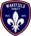
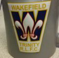
| Quote: BOJ04 "excuse my little knowledge as I have only been a fan since I lived in wakey in early 2000's but what is the symbol?
looks good but'"
Hope this helps 
The Arms used by the city of Wakefield have been for at least five centuries "Azure, a fleur-de-lis or" (a golden lily on a blue shield). These arms appear on a carved wooden boss on the Cathedral roof, which may be dated not later than 1470. Single fleur-de-lis appear on the frieze of the choir screen (1635) and also on the badge of the Wakefield Waits (168icon_cool.gif.
A fair bit more history than the "Wildcat" |
|
|
|
|
| Rank | Posts | Team |
| International Chairman | 1468 | |
| Joined | Service | Reputation |
| Dec 2001 | 23 years | |
| Online | Last Post | Last Page |
| Jan 1970 | Jun 2022 | LINK |
| Milestone Posts |
|
| Milestone Years |
|
|
| Location |
|
| Signature |
: |
|
| Quote: vastman "As a Graphic Designer it's always been my belief that where sport is cincerned especially RL bold block primary colours work best - hate kits with pintripes and fades, just awfull. Ditto the badge which is defacto your logo. A good logo is simple and the best can be re-produced by an average 8 year old with a pencil - the VW badge, Apple and the Triumph motorcycle logo, very simple hugely recogniseable.
Design is hugely subjective IMO and ahough the new badge is not a design classic in my eyes it is timeless, uncluttered and the more it's used the more memorable it will become and it will look right on almost anything, basic good design.'"
Less is certainly more in this case, however you can't just stick an emblem and a random font on a crest/badge and expect it to work - it all needs to tie together with the overall image. Originally, to me anyway, the typography chosen looked a little lost and not exactly traditional, and the badge itself looked a bit flat/dull - almost like it was designed by a college student on Microsoft Word. Looks like it's been given a little bit more TLC since I first saw it (bolder text, subtle shading) and now I've seen it with all the branding I definitely like it. But as you say, design is subjective...and that's just my opinion. |
|
|
|
|
|
| Rank | Posts | Team |
| Club Coach | 36076 | |
| Joined | Service | Reputation |
| Oct 2004 | 20 years | |
| Online | Last Post | Last Page |
| Sep 2024 | Sep 2024 | LINK |
| Milestone Posts |
|
| Milestone Years |
|
|
| Location |
|
| Signature |
10363_1334937642.jpg
SUPPORT SWAG...:d7dc4b20b2c2dd7b76ac6eac29d5604e_10363.jpg |
|
| Quote: Jizzer "Less is certainly more in this case, however you can't just stick an emblem and a random font on a crest/badge and expect it to work - it all needs to tie together with the overall image. Originally, to me anyway, the typography chosen looked a little lost and not exactly traditional, and the badge itself looked a bit flat/dull - almost like it was designed by a college student on Microsoft Word. Looks like it's been given a little bit more TLC since I first saw it (bolder text, subtle shading) and now I've seen it with all the branding I definitely like it. But as you say, design is subjective...and that's just my opinion.'"
Nah to me it's fine, you can overdoo it IMHO - don't think it's in any way random looks planned out to m whilst the typography is bang up to date, whether you like it or not is a different matter - no design student would use a PC or any Microsoft programme! - some of the best logos were first drawn on the back of a fag packet - but yes hugely subjective, |
|
|
|
|
| Rank | Posts | Team |
| International Chairman | 1468 | |
| Joined | Service | Reputation |
| Dec 2001 | 23 years | |
| Online | Last Post | Last Page |
| Jan 1970 | Jun 2022 | LINK |
| Milestone Posts |
|
| Milestone Years |
|
|
| Location |
|
| Signature |
: |
|
| Quote: vastman " no design student would use a PC '"
Well, that would depend on which area of design you are in  But yes, I wouldn't have expected it was done in Microsoft Word...that would just be silly  |
|
|
|
|
| Rank | Posts | Team |
| Player Coach | 6293 | |
| Joined | Service | Reputation |
| Jan 2007 | 18 years | |
| Online | Last Post | Last Page |
| Sep 2024 | Aug 2024 | LINK |
| Milestone Posts |
|
| Milestone Years |
|
|
| Location |
|
| Signature |
31007_1580947500.jpg
EVENTUALLY, WE'LL WIN SOMETHING, ,MAYBE, IF I'M STILL ALIVE THEN:d7dc4b20b2c2dd7b76ac6eac29d5604e_31007.jpg |
|
| Quote: wrencat1873 "Hope this helps ![]()
Now just a footnote squeezed onto a black and amber shield.
The "sports and leisure" section of the website lists Cas Tigers before Wakefield Trinity but then it states also "teams like Featherstone Rovers". Fev have been relegated to a mere example.
|
|
|
|
|
| Rank | Posts | Team |
| Club Captain | 15 | |
| Joined | Service | Reputation |
| Oct 2016 | 8 years | |
| Online | Last Post | Last Page |
| Jun 2017 | Jan 2017 | LINK |
| Milestone Posts |
|
| Milestone Years |
|
|
| Location |
|
| Signature |
75443_1475716520.jpg
:d7dc4b20b2c2dd7b76ac6eac29d5604e_75443.jpg |
|
| Quote: Slugger McBatt "Now just a footnote squeezed onto a black and amber shield.
The "sports and leisure" section of the website lists Cas Tigers before Wakefield Trinity but then it states also "teams like Featherstone Rovers". Fev have been relegated to a mere example.'"
Exactly. Just because we're paranoid doesn't mean that they're not all out to get us
I wonder if our stadium ambitions will start to progress again once the building is started at Cas? They certainly seemed to stall when Glasshoughton fell apart. |
|
|
|
|
| Rank | Posts | Team |
| Player Coach | 2107 | No
Team
Selected |
| Joined | Service | Reputation |
| Jul 2009 | 15 years | |
| Online | Last Post | Last Page |
| Jun 2018 | Jun 2018 | LINK |
| Milestone Posts |
|
| Milestone Years |
|
|
| Location |
|
| Signature |
: |
|
|
Looks at hulls new kit ISC will be doing some good shirt designs this year, can't wait to see ours.
Up the Trin
|
|
|
|
|
| Rank | Posts | Team |
| Player Coach | 1841 | |
| Joined | Service | Reputation |
| Jan 2010 | 15 years | |
| Online | Last Post | Last Page |
| Oct 2023 | Aug 2021 | LINK |
| Milestone Posts |
|
| Milestone Years |
|
|
| Location |
|
| Signature |
47943_1488655163.jpg
http://flightsandfrustration.com/
It is "Fifita" not "Fafita"
If you don't know the difference between "there", "their" and "they're" I might get annoyed.
Sharing First World problems so you can get it right first time.
Millionaires wanted. Apply here --- Wakefield Trinity:d7dc4b20b2c2dd7b76ac6eac29d5604e_47943.jpg |
|
|
In the interests of the rebrand could the moderators put forward a request that the site developers of RLFans rename this board as "Wakefield Trinity" rather than the old "Wakefield Trinity Wildcats"? The club has effectively rebranded so maybe this site can too.
|
|
|
|
|
| Rank | Posts | Team |
| Moderator | 12488 | |
| Joined | Service | Reputation |
| Jul 2002 | 22 years | |
| Online | Last Post | Last Page |
| Sep 2024 | Sep 2024 | LINK |
| Milestone Posts |
|
| Milestone Years |
|
|
| Location |
|
| Signature |
2358_1651040874.jpg
Wakefield TRINITY:d7dc4b20b2c2dd7b76ac6eac29d5604e_2358.jpg |
Moderator
|
| Quote: wildshot "In the interests of the rebrand could the moderators put forward a request that the site developers of RLFans rename this board as "Wakefield Trinity" rather than the old "Wakefield Trinity Wildcats"? The club has effectively rebranded so maybe this site can too.'"
Consider it done. |
|
|
|
|
|
|
|