Bottom left

all are good options though IMO.
I will say that the bottom right logo with the cherry colour, whilst in further reference to Wigan's colours, uses too many colours IMO. The black is more simplistic for the purposes of the logo and has less going on.
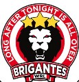
As good as the Wigan Ultras logo was I think the new Brigantes designs are superior. As has already been alluded to the "Brigantes" has a more original, unique and ultimately Wigan feel about it.
Keep it up! The newer, smaller flags in the crowd were a good touch too.