Quote Deeeekos="Deeeekos"https://indd.adobe.com/view/3d3e261d-1fa5-41de-8aee-f89dad654e96'"
I think the growl from the Leopard was sampled from my bathroom sink...
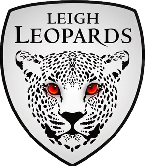
The logo looks somewhat professional, but that kit looks like an absolute joke in all honesty. And part of me thinks that this is actually still a joke for marketing. Alliteration works for teams like Bradford, Wigan and Warrington. Leigh Leopards just doesn't sound right at all.
I think the current logo needed a slight revamp, but it looks quite good as all white on a red background. Rebranding is understandable, I get that, but you just know when something doesn't look or sound right, and I this is one of those times.
I'd suggest the Leigh Radfords, or the Leigh Briers as potentially better names.