|
 |
| Rank | Posts | Team |
| Club Captain | 146 | No
Team
Selected |
| Joined | Service | Reputation |
| May 2019 | 6 years | |
| Online | Last Post | Last Page |
| Feb 2022 | Mar 2020 | LINK |
| Milestone Posts |
|
| Milestone Years |
|
|
| Location |
|
| Signature |
|
TO BE FIXED |
|
|
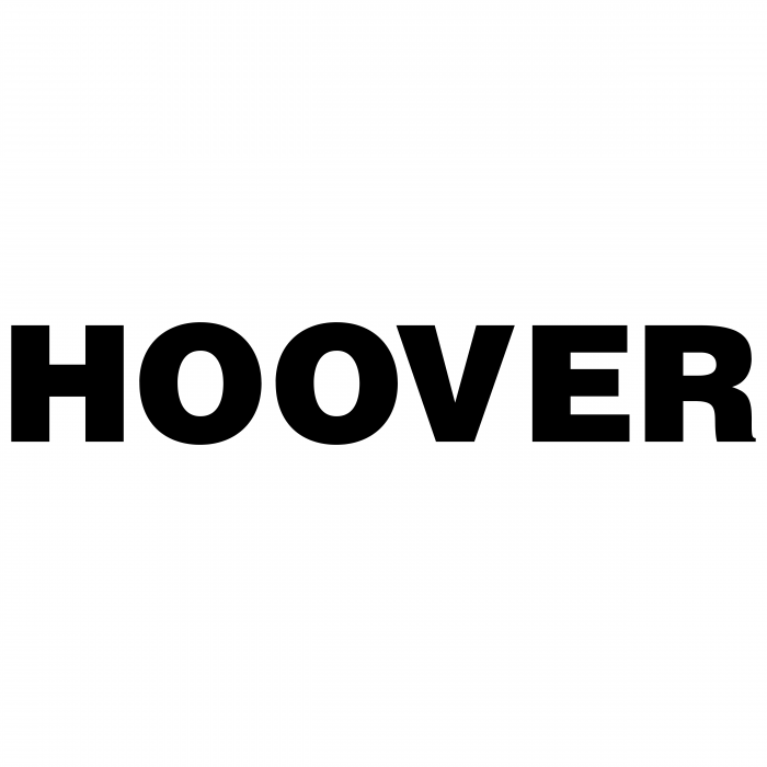
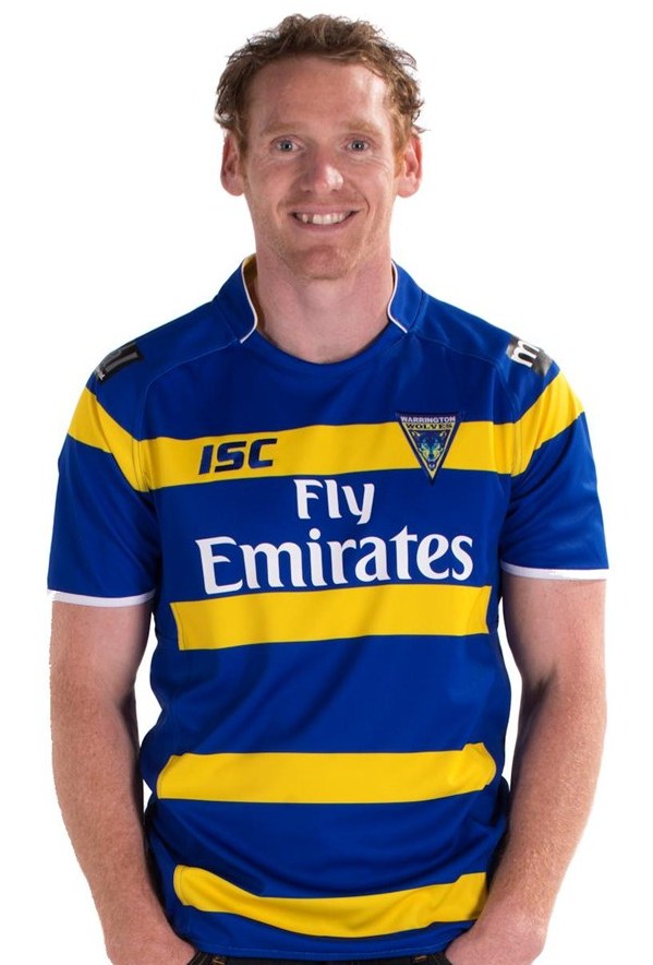
Warrington have had many a kit with a V on in the past! It looks nothing like a Saints top. It’s primrose and blue! It’s a pity about the hoover logo which absolutely ruins what would’ve been a belter!!
|
|
|
| Rank | Posts | Team |
| Player Coach | 939 | No
Team
Selected |
| Joined | Service | Reputation |
| Dec 2008 | 16 years | |
| Online | Last Post | Last Page |
| Oct 2023 | May 2022 | LINK |
| Milestone Posts |
|
| Milestone Years |
|
|
| Location |
|
| Signature |
|
TO BE FIXED |
|
|
Home one is great, love bold colours matched with simple design.
Away one is very dull
|
|
|
|
|
| Rank | Posts | Team |
| International Chairman | 5898 | Warrington Wolves |
| Joined | Service | Reputation |
| Dec 2001 | 23 years | |
| Online | Last Post | Last Page |
| Apr 2025 | Jan 2025 | LINK |
| Milestone Posts |
|
| Milestone Years |
|
|
| Location |
|
| Signature |
|
TO BE FIXED |
|
| 

Not sure, I think I'll need to see them in person.
Should have just adapted the plain text Hoover logo. It would have still been bold if they wanted it to stand out, Fly Emirates stood out with just text.
 |
|
|
| Rank | Posts | Team |
| Moderator | 6160 | Warrington Wolves |
| Joined | Service | Reputation |
| Feb 2012 | 13 years | |
| Online | Last Post | Last Page |
| May 2025 | Feb 2025 | LINK |
| Milestone Posts |
|
| Milestone Years |
|
|
| Location |
|
| Signature |
|
TO BE FIXED |
Moderator
|
| Quote rubber duckie="rubber duckie"Purposely UR, I couldn't bring myself to call it primrose looking like a Saints top.'"
It might have a V and a deep one at that but as our pal Al from Widnes confirms we've had V's before. Apart from the colours the main thing that distinguishes this from a Saints shirt is the sponsor, luckily for them Cash Converters is a good fit in quality and colour |
|
|
| Rank | Posts | Team |
| Player Coach | 17440 | Warrington Wolves |
| Joined | Service | Reputation |
| Mar 2008 | 17 years | |
| Online | Last Post | Last Page |
| May 2025 | Feb 2025 | LINK |
| Milestone Posts |
|
| Milestone Years |
|
|
| Location |
|
| Signature |
|
TO BE FIXED |
|
|
The away one looks like Bournemouth FC.
If I had to choose I'd go away.
|
|
|
|
|
| Rank | Posts | Team |
| Player Coach | 17440 | Warrington Wolves |
| Joined | Service | Reputation |
| Mar 2008 | 17 years | |
| Online | Last Post | Last Page |
| May 2025 | Feb 2025 | LINK |
| Milestone Posts |
|
| Milestone Years |
|
|
| Location |
|
| Signature |
|
TO BE FIXED |
|
| Quote Uncle Rico="Uncle Rico"It might have a V and a deep one at that but as our pal Al from Widnes confirms we've had V's before. Apart from the colours the main thing that distinguishes this from a Saints shirt is the sponsor, luckily for them Cash Converters is a good fit in quality and colour'"
Well that thought is in my mind now UR. I can't erase the Saintsness.
I'm hoping we draw Leeds in both finals now to okay in away colours.
Some posters have put some fantastic efforts up from designer sites over the seasons too. |
|
|
| Rank | Posts | Team |
| International Star | 867 | Warrington Wolves |
| Joined | Service | Reputation |
| Apr 2012 | 13 years | |
| Online | Last Post | Last Page |
| Aug 2024 | Aug 2024 | LINK |
| Milestone Posts |
|
| Milestone Years |
|
|
| Location |
|
| Signature |
|
TO BE FIXED |
|
|
I like them both, let's hope the sizes are generous, can't bear the thought of having to go XXL
|
|
|
| Rank | Posts | Team |
| Player Coach | 17440 | Warrington Wolves |
| Joined | Service | Reputation |
| Mar 2008 | 17 years | |
| Online | Last Post | Last Page |
| May 2025 | Feb 2025 | LINK |
| Milestone Posts |
|
| Milestone Years |
|
|
| Location |
|
| Signature |
|
TO BE FIXED |
|
|
O'Neil were very tight and you'll like have to go an X up.
|
|
|
|
|
| Rank | Posts | Team |
| International Star | 4719 | Warrington Wolves |
| Joined | Service | Reputation |
| Jul 2015 | 10 years | |
| Online | Last Post | Last Page |
| May 2025 | Feb 2025 | LINK |
| Milestone Posts |
|
| Milestone Years |
|
|
| Location |
|
| Signature |
|
TO BE FIXED |
|
|
Hoover logo looks like a massive laser sight... (channeling my inner Bourne).
|
|
|
| Rank | Posts | Team |
| International Star | 2410 | No
Team
Selected |
| Joined | Service | Reputation |
| Jan 2015 | 10 years | |
| Online | Last Post | Last Page |
| May 2025 | Feb 2025 | LINK |
| Milestone Posts |
|
| Milestone Years |
|
|
| Location |
|
| Signature |
|
TO BE FIXED |
|
|
Yeah apart from the MASSIVE hoover logo i think these are stunning. I'm so glad the club have finally done something different this year with the shirts, really bored with shirts that look the same.
|
|
|
| Rank | Posts | Team |
| Moderator | 39723 | Warrington Wolves |
| Joined | Service | Reputation |
| Mar 2002 | 23 years | |
| Online | Last Post | Last Page |
| May 2025 | Dec 2024 | LINK |
| Milestone Posts |
|
| Milestone Years |
|
|
| Location |
|
| Signature |
|
TO BE FIXED |
Moderator
|
| I agree, i think its scandalous that this

Looked exactly 5he same as this

Which looked exactly the same as this

Which looked exactly the same as this

Which looked exactly the same as this
 |
|
|
|
| Rank | Posts | Team |
| Moderator | 39723 | Warrington Wolves |
| Joined | Service | Reputation |
| Mar 2002 | 23 years | |
| Online | Last Post | Last Page |
| May 2025 | Dec 2024 | LINK |
| Milestone Posts |
|
| Milestone Years |
|
|
| Location |
|
| Signature |
|
TO BE FIXED |
Moderator
|
|
Shall i do the away shirts as well?
|
|
|
|
|
|