| FORUMS > Warrington Wolves > New Crest |

 |
|
|
| Rank | Posts | Team |
| International Star | 1598 |  |
| Joined | Service | Reputation |
| May 2014 | 11 years | |
| Online | Last Post | Last Page |
| Mar 2020 | Mar 2020 | LINK |
| Milestone Posts |
|
| Milestone Years |
|
|
| Location |
|
| Signature |
: |
|
|
I expecting to come on here this morning and see absolute outrage, but it's good to see lots of level-headed points and that most like it.
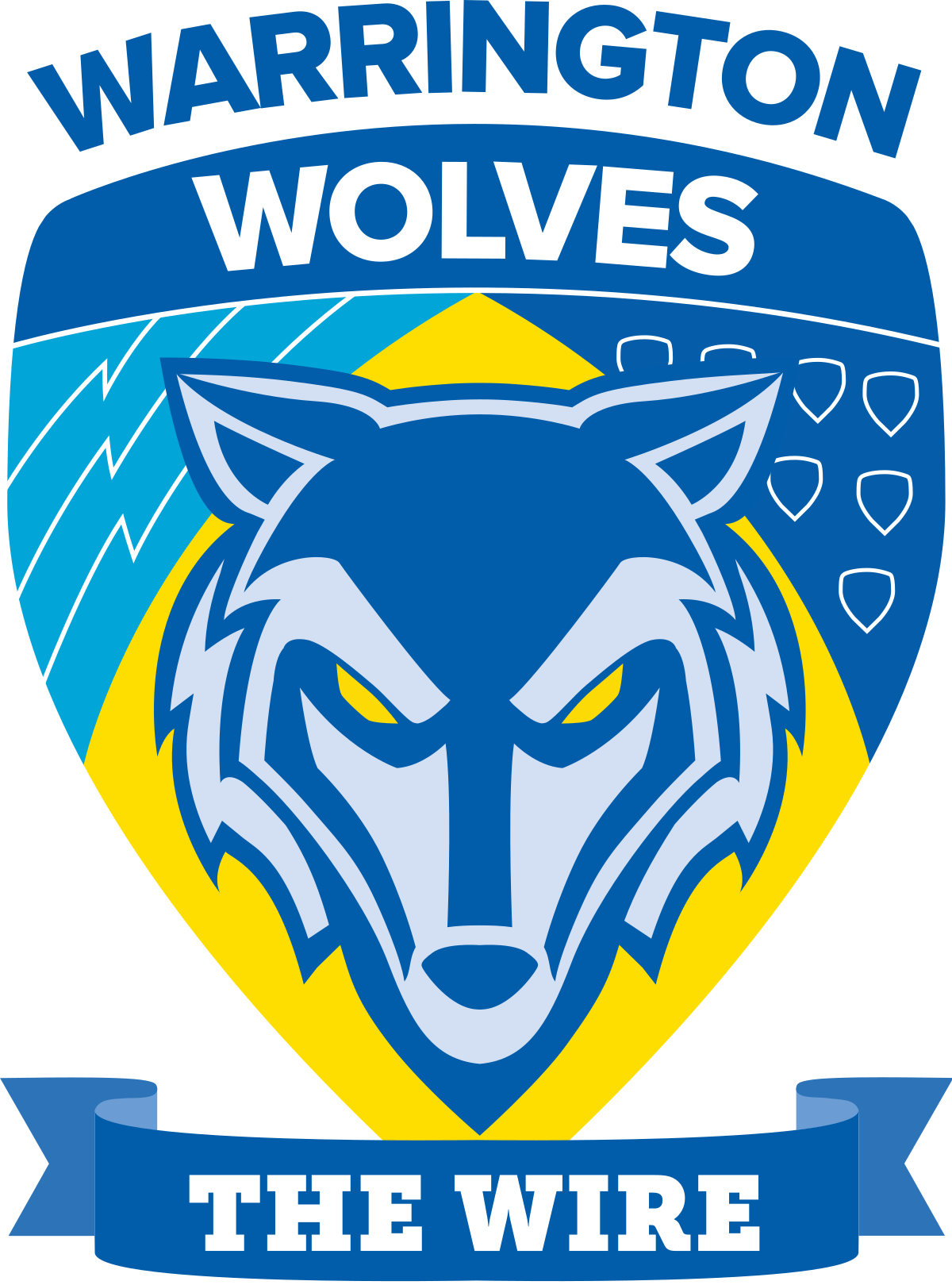
I like it. When I first saw it I was a bit "oh dear God" but then it grew on me within minutes, the more I look at it the more I understand why they did and I can get definitely get behind it, it'll appear to a wider audience for sure.
P.S. this is why you don't get club badges tattooed!
|
|
|
|
|
| Rank | Posts | Team |
| International Star | 2980 |  |
| Joined | Service | Reputation |
| Apr 2015 | 10 years | |
| Online | Last Post | Last Page |
| Nov 2024 | Nov 2024 | LINK |
| Milestone Posts |
|
| Milestone Years |
|
|
| Location |
|
| Signature |
: |
|
|
I quite like it. Much prefer it to the existing which had no connection to the heritage of the club. Personally would of liked a bit more primrose in there, the one thing that stands out for me when you see a stand full of wire fans is how bright and colourful it is based on the club colours - the badge falls down a little there if I'm honest - but as I said I like it and like how it incorporates the history of the town and club.
Given how the club is promoting itself as engaging with its fans, I'm surprised that this wasn't put to some kind of vote, unless that happened at the recent forums some fans were invited to?
|
|
|
|
|
| Rank | Posts | Team |
| Moderator | 39717 |  |
| Joined | Service | Reputation |
| Mar 2002 | 23 years | |
| Online | Last Post | Last Page |
| Nov 2024 | Nov 2024 | LINK |
| Milestone Posts |
|
| Milestone Years |
|
|
| Location |
|
| Signature |
: |
Moderator
|
|
Bare in mind, people who are complaining about this, go back to October 96, I bet 99% of people hatedwhen the wolves name was implemented and the triangular badge revealed.
I know I thought it was craps at the time.
're the rhinos logo, that got pilloried like when that was released in 97 as it wasdaft looking and huge.
Twelve months from now, no one will care. It'll grow on you.
#hardwired
|
|
|
|
|
| Rank | Posts | Team |
| Player Coach | 1173 |  |
| Joined | Service | Reputation |
| Oct 2009 | 15 years | |
| Online | Last Post | Last Page |
| Nov 2024 | Nov 2024 | LINK |
| Milestone Posts |
|
| Milestone Years |
|
|
| Location |
|
| Signature |
47151_1279870671.jpg
:d7dc4b20b2c2dd7b76ac6eac29d5604e_47151.jpg |
|
| We are Warrington Wolves and have been for a good while, we were The Wire before that, trouble is we are in a marketing world and brand is everything. No way will everyone ever be happy, but that won't get in the way of merchandise sales, we can have a moan but still buy the shirts etc 
Anyway we have a new Chief and he needs to show his metal, this may or may not be one of his projects, but it's been introduced on his watch.
It's change and some folks can't handle that, for me I quite like and as was said earlier it will grow on people. |
|
|
|
|
|
| Rank | Posts | Team |
| International Star | 2484 | No
Team
Selected |
| Joined | Service | Reputation |
| Sep 2011 | 13 years | |
| Online | Last Post | Last Page |
| Aug 2017 | Nov 2016 | LINK |
| Milestone Posts |
|
| Milestone Years |
|
|
| Location |
|
| Signature |
62513_1315488299.png
[color=#0000FF:6eeyneer]ONE[/color:6eeyneer] [color=#FFFF00:6eeyneer]LOVE[/color:6eeyneer]
God bless the flag that I live under the colours of primrose and blue.:d7dc4b20b2c2dd7b76ac6eac29d5604e_62513.png |
|
|
I don't mind change for the better but this is just embarrassing. Can anyone tell me how this is part of some better brand? Why is it more marketable? I could pull a better badge out my Iestyn.
|
|
|
|
|
| Rank | Posts | Team |
| Player Coach | 177 | No
Team
Selected |
| Joined | Service | Reputation |
| Jan 2007 | 18 years | |
| Online | Last Post | Last Page |
| Oct 2016 | Oct 2016 | LINK |
| Milestone Posts |
|
| Milestone Years |
|
|
| Location |
|
| Signature |
: |
|
|
Personally i love it. Its refreshing and bright. The old logo was dark with no real identity. Brave move by the club and re-branding is not an easy decision to make. We should be applauding them for having the balls to take things forward and incorporating the heritage of the club is a true tribute to all our past players. To be a success you have to move forward sometimes it works sometimes it doesn't but at least the board are trying. The fan survey, the workshops and proper fan engagement is how you make a club a brand. Look at Manchester United they are a brand and its that brand that brings in the money.
|
|
|
|
|
|
| Rank | Posts | Team |
| Player Coach | 9680 |  |
| Joined | Service | Reputation |
| Jul 2009 | 15 years | |
| Online | Last Post | Last Page |
| Nov 2024 | Oct 2024 | LINK |
| Milestone Posts |
|
| Milestone Years |
|
|
| Location |
|
| Signature |
46003_1489786199.png
:d7dc4b20b2c2dd7b76ac6eac29d5604e_46003.png |
|
|
I actually really like the new badge now.
|
|
|
|
|
| Rank | Posts | Team |
| Club Coach | 1238 |  |
| Joined | Service | Reputation |
| Feb 2005 | 20 years | |
| Online | Last Post | Last Page |
| Dec 2020 | Dec 2020 | LINK |
| Milestone Posts |
|
| Milestone Years |
|
|
| Location |
|
| Signature |
13177.gif
//www.lostadio.co.uk:13177.gif |
|
| Quote: Fantastic Mr Catpiss "Bare in mind, people who are complaining about this, go back to October 96, I bet 99% of people hatedwhen the wolves name was implemented and the triangular badge revealed.
I know I thought it was craps at the time.
'"
They still do.
Quote: Fantastic Mr Catpiss "Personally i love it. Its refreshing and bright. The old logo was dark with no real identity. Brave move by the club and re-branding is not an easy decision to make. We should be applauding them for having the balls to take things forward and incorporating the heritage of the club is a true tribute to all our past players. To be a success you have to move forward sometimes it works sometimes it doesn't but at least the board are trying. The fan survey, the workshops and proper fan engagement is how you make a club a brand. Look at Manchester United they are a brand and its that brand that brings in the money.'"
Why is it a brave move? All business (should) re-brand from time to time; and branding is a lot more than just a logo change; a brand is your identity and includes your goals, morals and outlook as a company. It's who you are and how you want people to perceive you.
Fan workshops and engagement seem to be a good idea but who says the fans know what's best for the club. Half of the people who stand near me in the South Stand don't even know the rules of the game at times.
You can't compare this with how Manchester United have grown so large as a business. You think the club engage with the fans there? Most of them who helped build the club into what it is today have been alienated and priced out, replaced by customers from all over the world who are more willing to spend than someone from Stretford who has been supporting the club for 50 years. United's success story stems from many things. From Munich to winning the European Cup, from the red army of the 70's to good marketing in the 80's, and then to having success at just the right time that money came into the game.
Nobody likes change and it can take time for people to come around to it but that is a poor badge. I don't think the current one is great either to be honest. I've shown my wife this morning who has no connection with Warrington and her words were, "It looks very amateurish". Of the ten or so people I've shown it to this morning, nobody has had anything good to say about it.
The only redeeming feature for me is that the man/wolf/badger/transformer in the middle could be used in isolation on a range of merchandise and look half decent. |
|
|
|
|
|
| Rank | Posts | Team |
| International Chairman | 4712 | No
Team
Selected |
| Joined | Service | Reputation |
| Feb 2002 | 23 years | |
| Online | Last Post | Last Page |
| May 2021 | May 2021 | LINK |
| Milestone Posts |
|
| Milestone Years |
|
|
| Location |
|
| Signature |
1124_1283371467.gif
:d7dc4b20b2c2dd7b76ac6eac29d5604e_1124.gif |
|
|
Saw it last night. Hated it. Saw it this morning and it's growing on me.
More child-like design but will probably sell better on merchandise etc.
Now they just need to announce a kit supplier change to Canterbury or Nike and all will be well for me.
|
|
|
|
|
| Rank | Posts | Team |
| Club Owner | 4250 |  |
| Joined | Service | Reputation |
| Jan 2004 | 21 years | |
| Online | Last Post | Last Page |
| Nov 2024 | Oct 2024 | LINK |
| Milestone Posts |
|
| Milestone Years |
|
|
| Location |
|
| Signature |
8083.jpg
[b:1in27wd6][color=#4040FF:1in27wd6][size=100:1in27wd6]top flight since 1895[/size:1in27wd6][/color:1in27wd6][/b:1in27wd6]:8083.jpg |
|
|
my opinion...first impression...its not brilliant....it might grow on me....but 1st impressions tend to stick with brand identities.
I give that opinion as a fan of 30 years and a professional designer of 20 years. If anyone in my team had produced that...it wouldn't have been presented to the client.
The wolf looks like some sort of weird robot with it mouth open, the wire flash at the bottom looks stuck on as a last minute thought and it totally ruins the dynamic shape of the shield ....the pointy bit at the bottom...any decent shield design has the pointy end visible...makes it look stronger and edgier. And why the light blue colour? We are primrose and blue....not primrose and several shades of blue..some wishy washy.
I'd like to know who did this, and how much it cost. Was it put out to tender? And why weren't the fans consulted?
Of course this is just my opinion...and its subjective. Maybe it will grow on me.
|
|
|
|
|
| Rank | Posts | Team |
| Player Coach | 17279 |  |
| Joined | Service | Reputation |
| Mar 2008 | 17 years | |
| Online | Last Post | Last Page |
| Nov 2024 | Nov 2024 | LINK |
| Milestone Posts |
|
| Milestone Years |
|
|
| Location |
|
| Signature |
38352_1407962301.jpg
Packs Win Games
Great Packs Make All Backs Look Class
#onceawirealwaysawire:d7dc4b20b2c2dd7b76ac6eac29d5604e_38352.jpg |
|
|
It's horrid but so was the last one, but at least it says the wire on it, and it wont make any difference what my thoughts are, so it'll do like the last one did.
To be honest, after the 74 coat of arms, I hated the 75-79 blue shirt with the big W. Yet I'd love to see us in that retro shirt now.
|
|
|
|
|
| Rank | Posts | Team |
| Club Coach | 1238 |  |
| Joined | Service | Reputation |
| Feb 2005 | 20 years | |
| Online | Last Post | Last Page |
| Dec 2020 | Dec 2020 | LINK |
| Milestone Posts |
|
| Milestone Years |
|
|
| Location |
|
| Signature |
13177.gif
//www.lostadio.co.uk:13177.gif |
|
| Quote: Oxford Exile "my opinion...first impression...its not brilliant....it might grow on me....but 1st impressions tend to stick with brand identities.
I give that opinion as a fan of 30 years and a professional designer of 20 years. If anyone in my team had produced that...it wouldn't have been presented to the client.
The wolf looks like some sort of weird robot with it mouth open, the wire flash at the bottom looks stuck on as a last minute thought and it totally ruins the dynamic shape of the shield ....the pointy bit at the bottom...any decent shield design has the pointy end visible...makes it look stronger and edgier. And why the light blue colour? We are primrose and blue....not primrose and several shades of blue..some wishy washy.
I'd like to know who did this, and how much it cost. Was it put out to tender? And why weren't the fans consulted?
Of course this is just my opinion...and its subjective. Maybe it will grow on me.'"
Absolutely spot on. If this was a GCSE design project, then the student may good good marks if they could back up the theory behind the design. THE WIRE hasn't even been done to the contours of the ribbon.
As for the branding, you either drop the Wolves completely, or you keep it. The fans have and will always acknowledge us as the wire. Even as new generations have come through, Wolves has never caught on. Having the Wire on the badge makes no difference to the perception of the club from inside or outside. As far as I can see, we're still Warrington Wolves. This is what it will say on the fixture list, on the BBC website and what will come out of Sky Commentators mouths.
I too would love to hear how much they've paid for this. |
|
|
|
|
| Rank | Posts | Team |
| Player Coach | 17279 |  |
| Joined | Service | Reputation |
| Mar 2008 | 17 years | |
| Online | Last Post | Last Page |
| Nov 2024 | Nov 2024 | LINK |
| Milestone Posts |
|
| Milestone Years |
|
|
| Location |
|
| Signature |
38352_1407962301.jpg
Packs Win Games
Great Packs Make All Backs Look Class
#onceawirealwaysawire:d7dc4b20b2c2dd7b76ac6eac29d5604e_38352.jpg |
|
|
Not as much as Warrington borough council paid for the green lemon slice logo before returning to our coat of arms....we paid in taxes £200,000 for the logo alone plus £1000's to change all the letter headings etc....and now we've just had our tax pay for reverting the logo back again.
|
|
|
|
|
| Rank | Posts | Team |
| Player Coach | 2024 | No
Team
Selected |
| Joined | Service | Reputation |
| Sep 2009 | 15 years | |
| Online | Last Post | Last Page |
| Jan 2022 | Jan 2022 | LINK |
| Milestone Posts |
|
| Milestone Years |
|
|
| Location |
|
| Signature |
: |
|
|
What we need now is to transform Wolfie into a snarling fearsome beast, perhaps based on Fenrir from Norse mythology (going down the line of that scary mascot Partick Thistle FC have now got).
|
|
|
|
|
| Rank | Posts | Team |
| Club Owner | 4250 |  |
| Joined | Service | Reputation |
| Jan 2004 | 21 years | |
| Online | Last Post | Last Page |
| Nov 2024 | Oct 2024 | LINK |
| Milestone Posts |
|
| Milestone Years |
|
|
| Location |
|
| Signature |
8083.jpg
[b:1in27wd6][color=#4040FF:1in27wd6][size=100:1in27wd6]top flight since 1895[/size:1in27wd6][/color:1in27wd6][/b:1in27wd6]:8083.jpg |
|
|
www.foggassociates.com/
this is the agency that did it....they certainly have good creds....but the badge design looks clip art-esque. 2/10
|
|
www.foggassociates.com/
this is the agency that did it....they certainly have good creds....but the badge design looks clip art-esque. 2/10
| |
|
|
|
|

 |
|

 |
