| FORUMS > The Virtual Terrace > Club Kit Designs |

 |
|
|
| Rank | Posts | Team |
| Club Captain | 268 |  |
| Joined | Service | Reputation |
| Feb 2020 | 5 years | |
| Online | Last Post | Last Page |
| Oct 2023 | May 2022 | LINK |
| Milestone Posts |
|
| Milestone Years |
|
|
| Location |
|
| Signature |
: |
|
|
The wildcats name can't have gone over well with traditionalists. Especially when Trinity is such a historic name.
At least we had the wolf on the town coat of arms, so there was some connection for the American-style nickname.
The redesigned Trinity badge is now the best in the league IMO.
|
|
|
|
|
| Rank | Posts | Team |
| International Board Member | 13619 | No
Team
Selected |
| Joined | Service | Reputation |
| Nov 2002 | 22 years | |
| Online | Last Post | Last Page |
| Nov 2024 | Nov 2024 | LINK |
| Milestone Posts |
|
| Milestone Years |
|
|
| Location |
|
| Signature |
3357_1596183529.jpg
:d7dc4b20b2c2dd7b76ac6eac29d5604e_3357.jpg |
|
| Quote: davids "The wildcats name can't have gone over well with traditionalists. Especially when Trinity is such a historic name.
At least we had the wolf on the town coat of arms, so there was some connection for the American-style nickname.
The redesigned Trinity badge is now the best in the league IMO.'"
I think the new Trinity badge is a great idea but very badly executed.
Best badge/branding in the league is Toronto, the two hull club badges are also good. |
|
|
|
|
| Rank | Posts | Team |
| International Chairman | 1470 |  |
| Joined | Service | Reputation |
| Dec 2001 | 23 years | |
| Online | Last Post | Last Page |
| Jan 1970 | Jun 2022 | LINK |
| Milestone Posts |
|
| Milestone Years |
|
|
| Location |
|
| Signature |
: |
|
| Quote: christopher "I think the new Trinity badge is a great idea but very badly executed.
Best badge/branding in the league is Toronto, the two hull club badges are also good.'" how is it badly executed its Fleur-de-lis and I should imagine previous ones will have a copy right |
|
|
|
|
| Rank | Posts | Team |
| International Board Member | 13619 | No
Team
Selected |
| Joined | Service | Reputation |
| Nov 2002 | 22 years | |
| Online | Last Post | Last Page |
| Nov 2024 | Nov 2024 | LINK |
| Milestone Posts |
|
| Milestone Years |
|
|
| Location |
|
| Signature |
3357_1596183529.jpg
:d7dc4b20b2c2dd7b76ac6eac29d5604e_3357.jpg |
|
| Quote: snowie "how is it badly executed its Fleur-de-lis and I should imagine previous ones will have a copy right'"
I could go through a design critique but it'd be quite boring, 
I just think its not very well done and an opportunity missed when changing the name back to get some strong branding done, having said that it is by no means the worst in the league and I do appreciate that clubs do not have a huge amount of cash to spend on branding.
Not sure what you mean by copyright, a Fleur de lis can't be copyrighted |
|
|
|
|
|
| Rank | Posts | Team |
| International Chairman | 1470 |  |
| Joined | Service | Reputation |
| Dec 2001 | 23 years | |
| Online | Last Post | Last Page |
| Jan 1970 | Jun 2022 | LINK |
| Milestone Posts |
|
| Milestone Years |
|
|
| Location |
|
| Signature |
: |
|
| Quote: christopher "I could go through a design critique but it'd be quite boring, ![]()
It's far better than the wildcat it does represent the city of Wakefield though
|
|
|
|
|
| Rank | Posts | Team |
| International Board Member | 13619 | No
Team
Selected |
| Joined | Service | Reputation |
| Nov 2002 | 22 years | |
| Online | Last Post | Last Page |
| Nov 2024 | Nov 2024 | LINK |
| Milestone Posts |
|
| Milestone Years |
|
|
| Location |
|
| Signature |
3357_1596183529.jpg
:d7dc4b20b2c2dd7b76ac6eac29d5604e_3357.jpg |
|
| Quote: snowie "design of images can have copy rights through surley, it is plain and could of been more flamboyant
It's far better than the wildcat it does represent the city of Wakefield though'"
As it happens I'd have made in plainer, simplicity is best with branding, the plainest isn't the issue.
'Classic' shapes can't be copyrighted, the whole logo incorporating a shape can but the shape alone can't. |
|
|
|
|
|
| Rank | Posts | Team |
| International Chairman | 1470 |  |
| Joined | Service | Reputation |
| Dec 2001 | 23 years | |
| Online | Last Post | Last Page |
| Jan 1970 | Jun 2022 | LINK |
| Milestone Posts |
|
| Milestone Years |
|
|
| Location |
|
| Signature |
: |
|
| Quote: christopher "As it happens I'd have made in plainer, simplicity is best with branding, the plainest isn't the issue.
'Classic' shapes can't be copyrighted, the whole logo incorporating a shape can but the shape alone can't.'"
What's your take on your own club with the rhino would you prefer to have something that relates to your home city or you happy with the brand, personally I've always been envious of crests like Wigan and Halifax |
|
|
|
|
| Rank | Posts | Team |
| International Star | 4940 | No
Team
Selected |
| Joined | Service | Reputation |
| Feb 2011 | 14 years | |
| Online | Last Post | Last Page |
| Nov 2024 | Nov 2024 | LINK |
| Milestone Posts |
|
| Milestone Years |
|
|
| Location |
|
| Signature |
: |
|
| Quote: snowie "What's your take on your own club with the rhino would you prefer to have something that relates to your home city or you happy with the brand, personally I've always been envious of crests like Wigan and Halifax'"
as a Rhinos fan, but i am not from the city, although it is my local big city, i personally prefer the brand, i know some people do not like the Americanisation of sports branding, but it works for us and i always liked it. I remember when we announced the Rhinos name, how people ridiculed it and said it was the worse name and would nor last. The Club has created a fantastic recognised brand and one of the few RL brands well known nationally. see no benefit of every going backward just to pacify a few vocal traditionalists. |
|
|
|
|
|
| Rank | Posts | Team |
| International Star | 4940 | No
Team
Selected |
| Joined | Service | Reputation |
| Feb 2011 | 14 years | |
| Online | Last Post | Last Page |
| Nov 2024 | Nov 2024 | LINK |
| Milestone Posts |
|
| Milestone Years |
|
|
| Location |
|
| Signature |
: |
|
| Quote: christopher "I agree, however I didn't do designs in that style because they had recently been done so there wasn't much point ![]() i like those older traditional Trinity strips. was watching an old episode of friends the other day The one where Ross tries Rugby (union) and the main guy running it is wearing what resembles a Wally Lewis era Blue trinity shirt.
i like those older traditional Trinity strips. was watching an old episode of friends the other day The one where Ross tries Rugby (union) and the main guy running it is wearing what resembles a Wally Lewis era Blue trinity shirt.
|
|
|
|
|
| Rank | Posts | Team |
| International Star | 4940 | No
Team
Selected |
| Joined | Service | Reputation |
| Feb 2011 | 14 years | |
| Online | Last Post | Last Page |
| Nov 2024 | Nov 2024 | LINK |
| Milestone Posts |
|
| Milestone Years |
|
|
| Location |
|
| Signature |
: |
|
| Quote: davids "This was the Trinity kit I hated. But it wasn't traditional either.
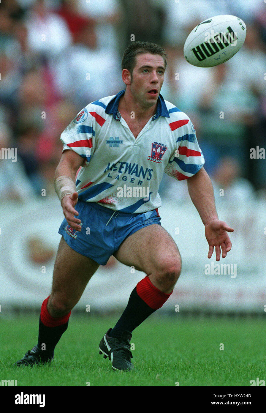 '" '"
early 90's kit revolution produced some class shirts and some absolute dross, one of the worst must be the Fev shirt circa 1994 the one with orange hi viz bits, looked like a railway track workers jacket. |
|
|
|
|
| Rank | Posts | Team |
| International Board Member | 13619 | No
Team
Selected |
| Joined | Service | Reputation |
| Nov 2002 | 22 years | |
| Online | Last Post | Last Page |
| Nov 2024 | Nov 2024 | LINK |
| Milestone Posts |
|
| Milestone Years |
|
|
| Location |
|
| Signature |
3357_1596183529.jpg
:d7dc4b20b2c2dd7b76ac6eac29d5604e_3357.jpg |
|
| Quote: snowie "What's your take on your own club with the rhino would you prefer to have something that relates to your home city or you happy with the brand, personally I've always been envious of crests like Wigan and Halifax'"
The thing is about the Rhinos it's been very successful, do I particularly like the name, probably not but it has worked and is one of the Rl club brands that's well known, they would be mad to go back to just being Leeds RLFC now. Having a moniker that's tied the city/town is quite irrelevant if the brand is marketed well enough.
The logo itself is crap though but they have been very good at marketing it. |
|
|
|
|
| Rank | Posts | Team |
| Club Captain | 268 |  |
| Joined | Service | Reputation |
| Feb 2020 | 5 years | |
| Online | Last Post | Last Page |
| Oct 2023 | May 2022 | LINK |
| Milestone Posts |
|
| Milestone Years |
|
|
| Location |
|
| Signature |
: |
|
| 
Unfortunately for Leeds, 'The Owls' 'The Dead Sheep' or 'The Loiners' aren't really marketable nicknames, in the way that 'Wolves' or 'The Wire' would be, so I suppose they had to turn elsewhere. |
|
|
|
|
| Rank | Posts | Team |
| Club Captain | 2167 | No
Team
Selected |
| Joined | Service | Reputation |
| Aug 2018 | 6 years | |
| Online | Last Post | Last Page |
| Mar 2022 | Mar 2022 | LINK |
| Milestone Posts |
|
| Milestone Years |
|
|
| Location |
|
| Signature |
: |
|
|
Quote: christopher "I could go through a design critique but it'd be quite boring, ![]()
You are on the tricky ground there, I know a fair bit about branding and it actually ticks all the boxes. Don't get carried away mate your kit ideas are nice but you're not WPP plc!
So all you can do is give a personal opinion. I find it classical and traditional, real tradition, not a faux animal motif. Toronto is no more overrun by Wolves than any other Leeds is by Rhinos.
The Fleur-de-lis is the cities emblem has been for a very long time https://www.heraldry-wiki.com/heraldryw ... =Wakefield
The colours of the badge are the club colours.
The graphics are modern, plain and to the point, more importantly, they are visually concise and can be easily reproduced on almost any substrate, job done imo. |
|
Quote: christopher "I could go through a design critique but it'd be quite boring, ![]()
You are on the tricky ground there, I know a fair bit about branding and it actually ticks all the boxes. Don't get carried away mate your kit ideas are nice but you're not WPP plc!
So all you can do is give a personal opinion. I find it classical and traditional, real tradition, not a faux animal motif. Toronto is no more overrun by Wolves than any other Leeds is by Rhinos.
The Fleur-de-lis is the cities emblem has been for a very long time https://www.heraldry-wiki.com/heraldryw ... =Wakefield
The colours of the badge are the club colours.
The graphics are modern, plain and to the point, more importantly, they are visually concise and can be easily reproduced on almost any substrate, job done imo. | |
|
|
|
|
|
|
| Rank | Posts | Team |
| International Board Member | 13619 | No
Team
Selected |
| Joined | Service | Reputation |
| Nov 2002 | 22 years | |
| Online | Last Post | Last Page |
| Nov 2024 | Nov 2024 | LINK |
| Milestone Posts |
|
| Milestone Years |
|
|
| Location |
|
| Signature |
3357_1596183529.jpg
:d7dc4b20b2c2dd7b76ac6eac29d5604e_3357.jpg |
|
| Quote: Fishermanscap "You are on the tricky ground there, I know a fair bit about branding and it actually ticks all the boxes. Don't get carried away mate your kit ideas are nice but you're not WPP plc!
So all you can do is give a personal opinion. I find it classical and traditional, real tradition, not a faux animal motif. Toronto is no more overrun by Wolves than any other Leeds is by Rhinos.
The Fleur-de-lis is the cities emblem has been for a very long time
Not sure what you mean ‘tricky ground’ or getting carried away?
Fwiw I own a Creative Design & Branding Agency. I have worked in the industry for 25 years and won industry awards for Branding.
So yes it may be my personal opinion (design is subjective) but it’s also my professional opinion.
I have not criticised or questioned the use of a Fleur De Lis, I am well aware of the connection, I have questioned the implementation.
Glad you like Wakefields logo, and you’re perfectly entitled to. I think it’s a good idea badly implemented.
|
|
|
|
|
| Rank | Posts | Team |
| Moderator | 39717 |  |
| Joined | Service | Reputation |
| Mar 2002 | 23 years | |
| Online | Last Post | Last Page |
| Nov 2024 | Nov 2024 | LINK |
| Milestone Posts |
|
| Milestone Years |
|
|
| Location |
|
| Signature |
: |
Moderator
|
|
Kin ell, and he wonders why no one believes him when he says he not vastman.
|
|
|

 |
|

 |


 '"
'"
