| FORUMS > The Virtual Terrace > Club Kit Designs |

 |
|
|
| Rank | Posts | Team |
| International Star | 4469 |  |
| Joined | Service | Reputation |
| Jan 2013 | 11 years | |
| Online | Last Post | Last Page |
| Sep 2023 | Aug 2023 | LINK |
| Milestone Posts |
|
| Milestone Years |
|
|
| Location |
|
| Signature |
69704_1656949802.jpg
:d7dc4b20b2c2dd7b76ac6eac29d5604e_69704.jpg |
|
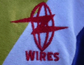
| Quote: davids "The Wire kits look decent. I recall that most fans hated the 'Christmas Tree' away kit at the time, except for kids/teenagers who went out and bought it in their droves.
I thought this was probably the more 'iconic' Wire away kit of the 90s, given we had so many great performances in it, but I always preferred horizontal stripes/hoops to vertical/soccer stripes.
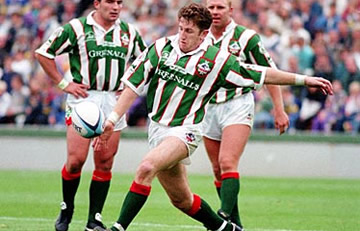 '" '"
An absolute classic |
|
|
|
|
| Rank | Posts | Team |
| International Board Member | 13352 | No
Team
Selected |
| Joined | Service | Reputation |
| Nov 2002 | 22 years | |
| Online | Last Post | Last Page |
| Jun 2024 | Jun 2024 | LINK |
| Milestone Posts |
|
| Milestone Years |
|
|
| Location |
|
| Signature |
3357_1596183529.jpg
:d7dc4b20b2c2dd7b76ac6eac29d5604e_3357.jpg |
|
|
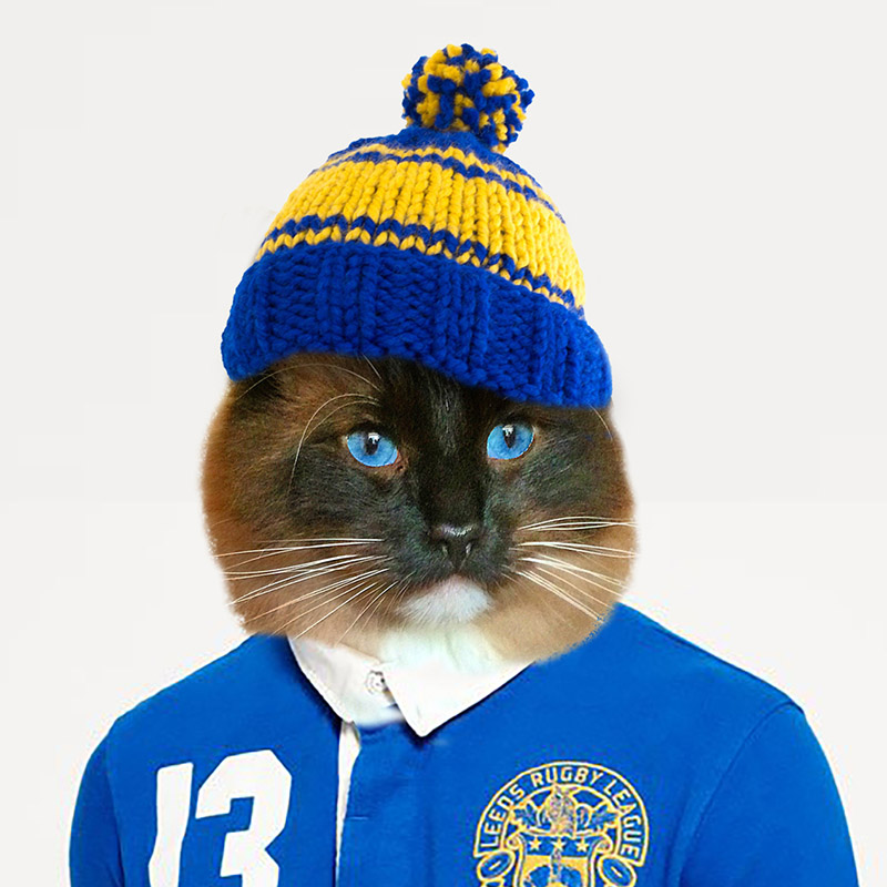
Yes I’m a fan of those logos, the Trinity one is not as good due to the things mentioned previous, which was my point, the idea was good but its just not been executed quite right, all IMO of course.
Yes did understand what you mean with the names, I m not a huge fan myself but it cannot be denied it has worked at my club (Leeds)
|
|
|
|
|
| Rank | Posts | Team |
| Club Captain | 2215 | No
Team
Selected |
| Joined | Service | Reputation |
| Jun 2019 | 5 years | |
| Online | Last Post | Last Page |
| Sep 2020 | Aug 2020 | LINK |
| Milestone Posts |
|
| Milestone Years |
|
|
| Location |
|
| Signature |
: |
|
| Quote: Fantastic Mr Catpiss "There's no point debating with him, he wont accept your opinion on trinity and will just shout you down, that's why I said what I said above cos he gave me the hairdryer treatment a few years back when u questioned the way they implemented the name change back to trinity.
We're all wrong, and that final.
It's all very well changing your name to try and leave that reputation behind, but if he's not willing to change the way he aggressively talks down to ppl, you dont need moderator powers to see it's still him.'"
Oh come on JEAN, everyone knows in 2018 you invented time travel for the sole purpose of journeying back to 2002 to create a login, become a moderator by using subliminal messaging to infiltrate Sadfish's subconcious, all so you could out vastman 18 years later....
 |
|
|
|
|
| Rank | Posts | Team |
| International Star | 4647 |  |
| Joined | Service | Reputation |
| Mar 2010 | 14 years | |
| Online | Last Post | Last Page |
| Jun 2024 | Jun 2024 | LINK |
| Milestone Posts |
|
| Milestone Years |
|
|
| Location |
|
| Signature |
50733_1530270912.jpg
[color=#000000:ogl9gbum]"Back home we got a taxidermy man. He gonna have a heart attack when he see what I brung him."[/color:ogl9gbum]:d7dc4b20b2c2dd7b76ac6eac29d5604e_50733.jpg |
|
|
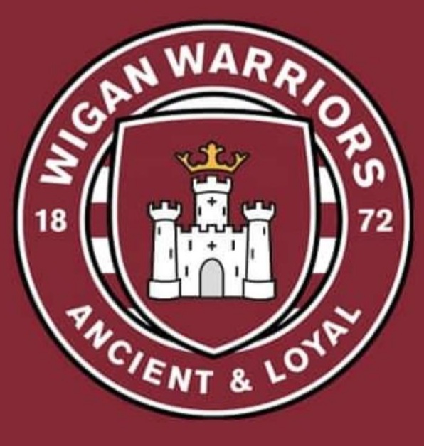
All good examples of traditional done modern. The Trinity badge would definitely benefit from being stripped down and minimalised to the level of the Hull KR badge. Obviously, it's not as easy with Trinity having a 3 colour pallete. Maybe it's the third colour which makes the Trinity logo appear fussy?
How great is that Notts Forest badge?!
|
|
|
|
|
|
| Rank | Posts | Team |
| International Board Member | 439 | No
Team
Selected |
| Joined | Service | Reputation |
| Jun 2002 | 22 years | |
| Online | Last Post | Last Page |
| Jan 2024 | Jan 2024 | LINK |
| Milestone Posts |
|
| Milestone Years |
|
|
| Location |
|
| Signature |
2182.gif
:2182.gif |
|
|
Great work Christopher, loved seeing your take on the club designs, I don’t understand why clubs manage to make such a mess of it each year.
What would you do with the current Leeds logo?
|
|
|
|
|
| Rank | Posts | Team |
| Moderator | 5870 |  |
| Joined | Service | Reputation |
| Feb 2012 | 12 years | |
| Online | Last Post | Last Page |
| Jul 2024 | Jul 2024 | LINK |
| Milestone Posts |
|
| Milestone Years |
|
|
| Location |
|
| Signature |
66556_1331046115.jpg
:d7dc4b20b2c2dd7b76ac6eac29d5604e_66556.jpg |
Moderator
|
| Quote: King Street Cat "All good examples of traditional done modern. The Trinity badge would definitely benefit from being stripped down and minimalised to the level of the Hull KR badge. Obviously, it's not as easy with Trinity having a 3 colour pallete. Maybe it's the third colour which makes the Trinity logo appear fussy?
How great is that Notts Forest badge?!'"
Notts COUNTY, NOTTINGHAM Forest sorry for the pedantry |
|
|
|
|
|
|
|