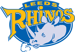
Quote MjM="MjM"It's always been a fairly cruddy logo and it's not helped by the club's inability to ever use it in a discrete manner on merchandise and continual desire to stick a giant sized version of that goddam thing on any old piece of tat.
FWIW I can't stand the fake historical look of the present LUFC logo and would rather we stuck with the present thing than go down that route.
GH is however unlikely to pay out for a rebranding excercise without their being a proven need.'"
I am not so sure that any rebranding exercise has to cost that much TBH. I think Wakey did a superb job & knowing Andrew Glover as I do now, I bet he spent a very modest amount to not a great deal! Of course, Glover took the opportunity to update Wakey's logo for several reasons, including to signal a change from the previous owners to himself, to 'bring back' the word Trinity & the Wakefield Fleur-de lis, at the fans request, and it also chimes well with the company name of Spirit of 1873 Ltd.
I think Wakey's logo is a great example of how you can refresh a logo without completely changing & rebranding. I bet if Gary offered some a free season ticket for next year if selected, quite a few of the creative folk who post on here could come up with some great ideas for a refreshed logo that would just be a new twist on the current one?


 nooooooo! And what's the relevance of 1895... ?